


Colour Psychology: How To Make An Emotional Connection With Your Customer
Published: 15/08/2014
Whether it's in home decoration, photography, film or a page design, there's no denying the power of colour.
If you are producing any form of promotional material, particularly printed documents, you cannot underestimate how important it is to consider the meaning of colours and how they affect your audience.
Let's take a look at some of the most important considerations about colour in print.
Colour Psychology
The entire purpose of any printed work is to encourage a target demographic to take some form of action. Whether it be to buy a product, sign up to a service, or to avoid a dangerous pathway, there is always a reason for the message.
Depending on the message you are trying to send, or the response you are attempting to provoke from your audience, colour psychology can help immensely in achieving the desired effect.
If you understand the psychology of colour, and how different colours inspire different emotions and actions in people, you can use this to your advantage to improve response rates and boost your return on investment.
Colour And Emotions
Whenever you are seeking to encourage somebody to take action, it is vital to make an emotional connection with the prospect. There are various ways that this can be achieved, from the text you use to get your message across, through to the overall design of a leaflet, poster or brochure.
Colour and emotions are also very closely linked, and effective use of colour can have a huge impact on the way an audience interprets your message and whether or not they act.
One of the most profound recent uses of colour to deliver a message in recent times was the way the Metro reported the death of Nelson Mandela. While the world mourned his passing, the Metro tweeted: “Tomorrow's front page. What words are there?”
The message was accompanied with an image of the paper's front page. Apart from the title, there was no headline or other text on the page. It simply contained a black and white image that powerfully engaged those who looked at it.
Other newspapers opted for colour images, but the Metro's take was most arresting, and stood out amongst the crowd.
It may sound silly to cite this example when talking about colour; but black and white can work to great effect when used sparingly. After all, they are colours in their own right, with properties and meanings that provoke responses within people just like any other colour.
Meaning Of Colours
As we know, different colours can provoke different responses in people. The colours that you choose to use should be dependent on the purpose of your message and the response you wish to incite.
So which meanings do colours have?
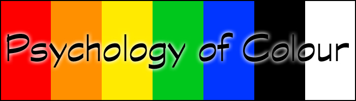
- Red: The meaning of the colour red is usually one of danger, warning or anger. It is an intense colour that is best used in print when you are highlighting something that people should avoid or approach with caution. Red may also denote passion or love, and is also a colour commonly associated with Christmas and the festive season.
- Orange: Orange is an energising colour that stirs up emotions of vibrancy, warmth and enthusiasm. It is a visually striking colour, so using orange in print can be a useful idea when seeking to grab somebody's attention.
- Yellow: Similarly to orange, yellow can have an arresting presence and can indicate hazards. It is therefore often used in warning signs alongside orange and red to alert people to potential dangers. However, yellow is also a colour that symbolises happiness and joy, particularly given that it is representative of the sun. Used in a summer-themed context, yellow can be useful in evoking an emotion of hope.
- Green: The colour green has a meaning that is strongly connected to nature and the environment. It is often used to mark spring and the birth of new life. Additionally, green symbolises health, youth and good luck. Green is also a globally recognised colour for “go”, so using green in a call to action can be a great way to encourage people to make a purchase or take the action you are looking for.
- Blue: A calming, peaceful colour, blue promotes a sense of trust and truthfulness. Using blue, which is a hugely popular colour, can help to build up confidence, security and loyalty. Blue is also associated with notions of cleanliness and order.
- Black: An extremely powerful colour, black can denote and symbolise a number of emotions, including unhappiness, fear, mystery and sadness. It is commonly used as a colour of death and mourning.
- White: The colour white can be equally as powerful as black. White is a colour that symbolises purity, simplicity, cleanliness and innocence. It can also have an emotive effect by denoting peace, humility and reverence, and it is usually seen as a colour of good.
It is now clear to see why the Metro's black and white Mandela front page was so powerful; combining the black of mourning with the white of peace, something that Mandela fought so hard for throughout his life.
Of course, there are many different colours, shades and combinations that can be used to create an emotional response. These are just some of the most popular and common colours that are used to create a reaction in an audience.
Using Colour To Make A Connection
Whatever the purpose of your printed materials, it's important that you take some time to consider which colours best suit your needs. Think about the emotions that you wish your customers to feel when they read your poster, leaflet, flyer or brochure.
From there, you can incorporate splashes of the colours that symbolise these emotions, in order to make an emotional connection with your audience. This way, you can tap into the psychology of colour to improve the success of your work by encouraging people to act and react in the way that you want.
Free UK Delivery
on all orders
on all orders
Free File Check &
Emailed Proof
Emailed Proof
FSC Registered
Company
Company
Express Service
up to 80% Faster
up to 80% Faster