


The Colour Wheel: Using Colour Theory In Design
Published: 11/11/2014
Wherever you are, there are different colours all around you. It's no coincidence; colour schemes naturally occur in nature, but are also deliberately put together in fashion and design.
The same is true of graphic design in terms of leaflets, posters, brochures and any kind of printed marketing material. If you've read our previous post on colour theory, you'll already be aware of the power that colour can have on your readers and target audience.
That's right - colour is just as important in printed work as it is on your website. In fact, in some cases, it might be deemed even more important.
But how do you successfully partner up colours for an attractively designed piece of work?
Answer: The colour wheel.
So, what is the colour wheel, and how can it help you in your design process?
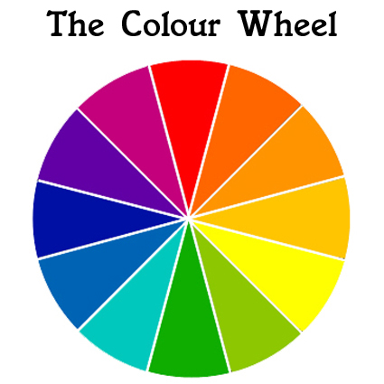
The Colour Wheel
As the name suggests, the colour wheel is a circular diagram with a range of different colours. These colours can be matched together in certain ways to create visually appealing designs.
The colours in the wheel are made up of three different groups; primary colours, secondary colours and tertiary colours.
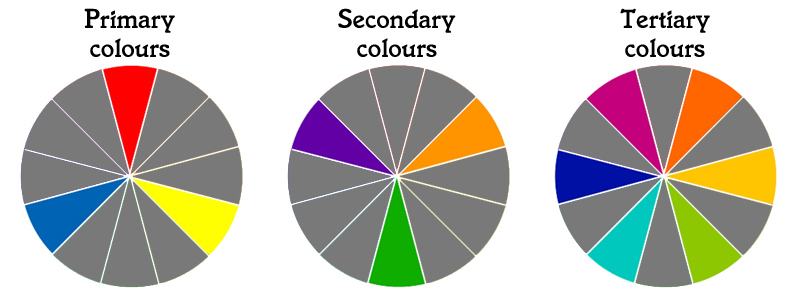
The primary colours are red, blue and yellow. These are colours that cannot be made from mixing other colours together.
The secondary colours are created when two primary colours are mixed together in equal parts. These are green (made when yellow and blue are mixed), orange (made from red and yellow), and purple (red and blue).
Finally, tertiary colours are formed when two parts of a primary colour are combined with one part of a secondary colour, like so:
- Two parts red + one part orange = red-orange
- Two parts red + one part purple = red-purple
- Two parts blue + one part purple = blue-purple
- Two parts blue + one part green = blue-green
- Two parts yellow + one part orange = yellow-orange
- Two parts yellow + one part green = yellow-green
In addition, the colour wheel can be divided into two halves; hot or warm colours, and cold or cool colours.
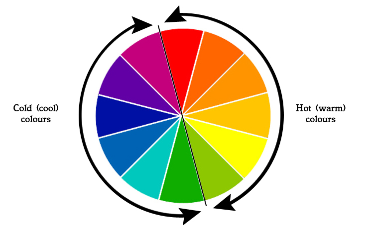
Warm colours colours can be used to evoke stimulating feelings or moods such as energy and warmth, while cool colours are more likely to have a calming and relaxing effect.
Your colour choice will depend on the purpose of the material that you are designing. If you need to capture somebody's attention and make them take action, warm colours will be the best choice. If your intention is to inform or relax somebody, a cool colours might be the better option.
Creating Matches With The Colour Wheel
There are several different ways that the colour wheel can be used to create attractive design combinations. Let's take a look at your options:
Analogous colour schemes
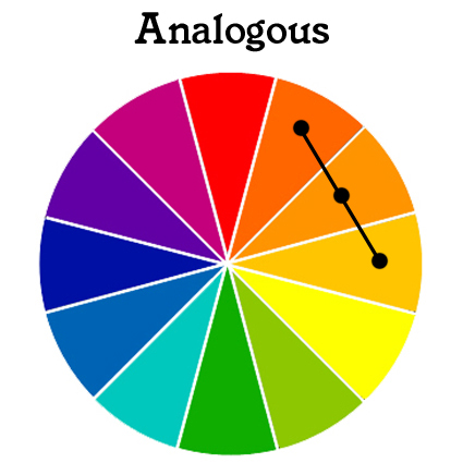
An analogous colour scheme uses two or three colours that are directly next to each other on the colour wheel. One of the chosen colours is normally used as a base colour, and is more dominant, while the others are used to support.
Complementary colour schemes
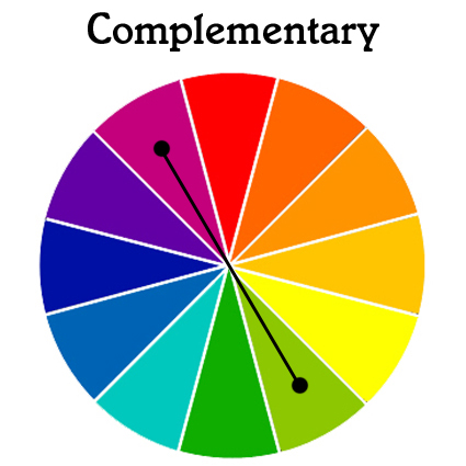
Using two colours that are directly opposite each other on the colour wheel is known as a complementary colour scheme. Usually, one colour will be more dominant, with its complement used sparingly as an accent colour for maximum effect.
Split-complementary colour schemes
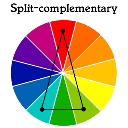
A different twist on the standard complementary colour scheme is the split-complementary option. Select one colour and then match it with the two colours either side of your base colour's complement. For example, red (whose complement is green) would be matched with the two neighbouring colours to green, blue-green and yellow-green.
Triadic colour schemes
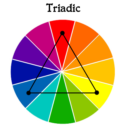
A triadic colour scheme involves matching three colours that are an equal distance away from each other; where the three points of an equilateral triangle would land. If the scheme is a little too garish or bold, it can be toned down by choosing just two of the schemes colours, and using them alongside a neutral colour such as white, black, brown or beige (more on neutral colours soon).
Square colour schemes

A square colour scheme involves choosing four colours that are spaced evenly around the colour wheel – where the four corners of a square would sit. This can again provide some colourful combinations, but remember that you don't have to use all the colours in equal measure; have one dominant colour and use the others sparingly to highlight only important information in your design.
Tetradic colour schemes
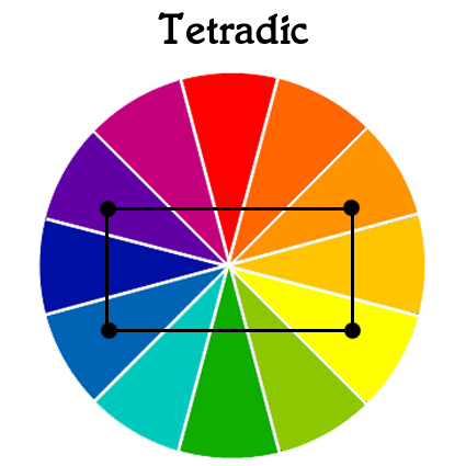
A tetradic colour scheme involves using two pairs of complementary colours together. Like square colour harmonies, tetradic colour schemes are most effective when one colour is chosen as a base, with the others used as accents to support. A tetradic scheme may also be referred to as a rectangle colour scheme, because it creates that shape on the colour wheel.
Monochromatic colour schemes
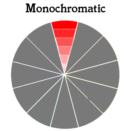
A final option can be a monochromatic colour scheme – one which uses just one colour. Using different shades of the same colour can be another great way to attract attention to your design.
A Note About Neutral Colours
This is all well and good, but you may be wondering where colours like white, black and brown fall into place.
Well, the reason that they're not included on the colour wheel is that they're not actually considered as 'colours'. Instead, they're known as 'non-colours'. But they can be used to create a powerful design, especially when used in conjunction with the colour harmonies that you create using the colour wheel.
The neutrals are compatible with almost all of the colour wheel's combinations, making them a versatile option when designing.
How Will You Use The Colour Wheel?
If you don't already, try using the colour wheel in your next design projects. You'll find it much easier to create harmonious colour matches that not only get your message across, but that look great on paper.
Which combinations are you going to try out?
Free UK Delivery
on all orders
on all orders
Free File Check &
Emailed Proof
Emailed Proof
FSC Registered
Company
Company
Express Service
up to 80% Faster
up to 80% Faster